
Skin Care Logo and Brand Identity for Skin Discovery
- vdelaplante
- May 19, 2023
- 2 min read
Updated: Jun 14, 2023

Results-Driven Holistic Skin Care
Skin Discovery is a boutique spa and an online skin care shop located Barrie Ontario. Christine provides highly individualized skin care routines to her clients and sets them up with professional and well researched product to tackle your needs.
Christine had been using a logo she DIY'd when she started her business back in 2019. After a few years in business, she decided it was time to invest in her brand and contacted me to develop her a brand new logo and identity that she can use for the years to come as her business grows.

With a vision for growth, it was crucial to create a logo that could adapt seamlessly to different contexts while remaining timeless and memorable.
Skin Care Logo and Brand Identity
Deliverables:
Main logo
Secondary logo
Logo icon
Colour Palette
Mockups
Business Card
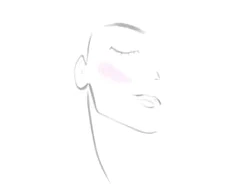
Brand Imagery and Typography
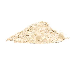
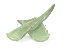
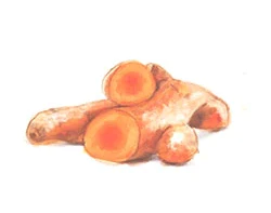
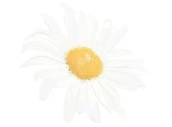
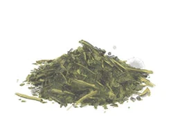
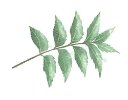
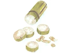
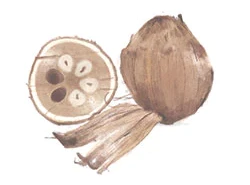
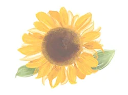
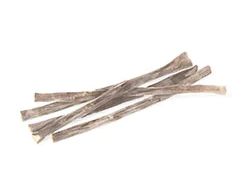
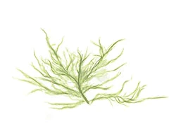
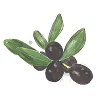
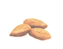
Custom water coloured icons
To encapsulate the essence of Skin Discovery within a visual identity, I designed a logo that was friendly fresh and adaptable.
The main logo features an arch, symbolizing strength and support, two core values of Skin Discovery.

The secondary logo strips the logo down to just the text which is strong enough to stand on its own. Lastly, we adapted the logo into a brand mark which blends the arch shape and type into a simple, yet memorable 'SD' icon.

The Skin Discovery colour palette comprises of navy, sage green, soft pinks, and terracotta, which reflects the relaxed and calming tone while giving off an appealing and trustworthy aesthetic.

The chosen typography, a dainty mixed weight sans serif, adds a touch of elegance and character, creating a memorable and distinctive look. The interplay between the logo's elements creates a harmonious balance, portraying the overall vibe of Skin Discovery as a trusted, knowledgeable friend who provides guidance and support throughout the skincare journey.


Comments