
ASHL Rebrand
- vdelaplante
- Dec 24, 2022
- 1 min read
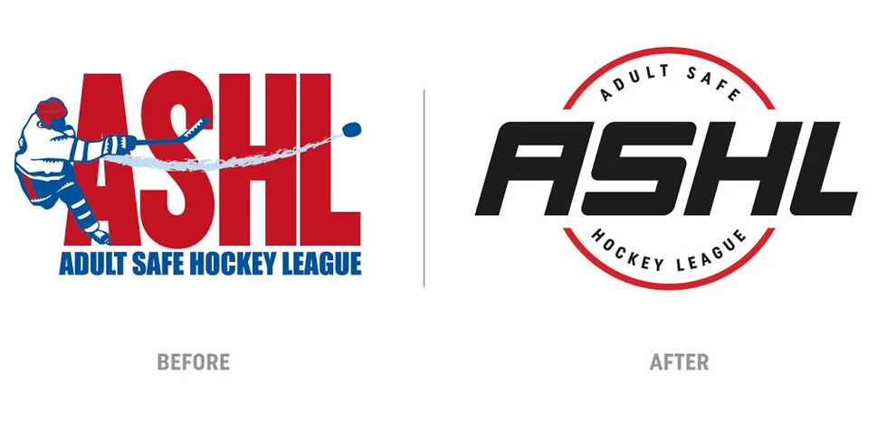
During my time at Canlan Sports, I was fortunate enough to be apart of the rebrand for the Adult Safe Hockey League (ASHL) — the largest recreational hockey league in North America.

After some initial research, each team member presented a logo concept to help nail down a direction. I was thrilled when my concept was chosen to be refined and finalized.
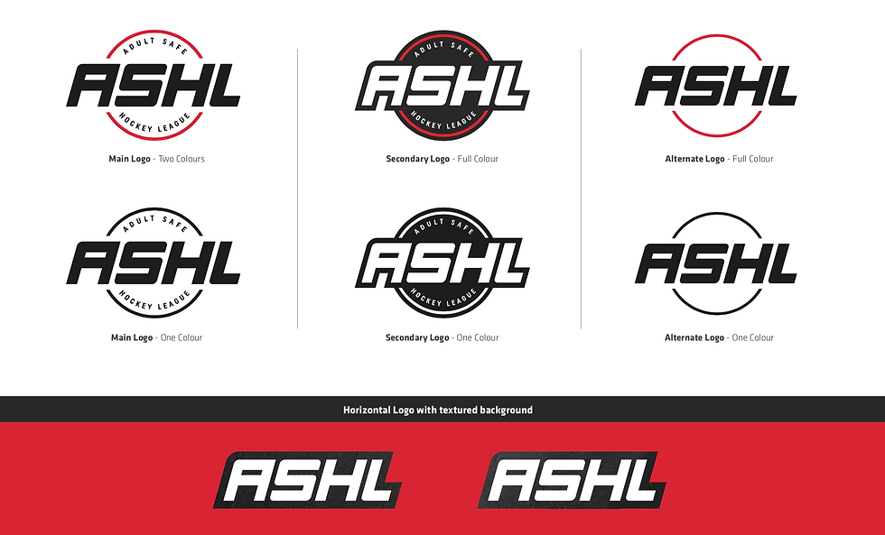
The original logo’s letterforms contained subtle embellishes which we’re removed for legibility purposes. We also felt they could date the logo easily and opted for something more simple. With the help of the entire creative team, the unique letterforms were developed as you see in the final renditions of the logo.
The website redesign is credited to the creative director of Canlan Sports, Alex. It was a complete custom build, which had many layers to it to bring all of the many facets of the brand together in an easy to digest way. Check out the website here.
What our team did:
Custom Logo Design
Colour palette development
Branding guide, with typography, imagery, iconography, and more
Marketing materials
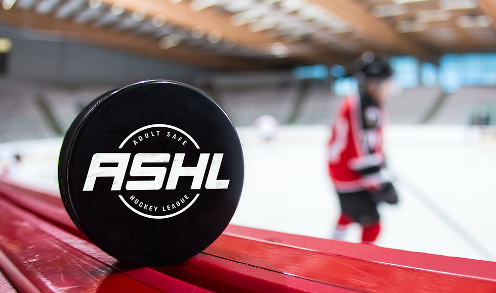
Custom photography, on and off ice with Knightvision Media


Comments